Samsung
Galaxy A27 5G introduces Samsung DeX, punch-hole display, and 5 key upgrades
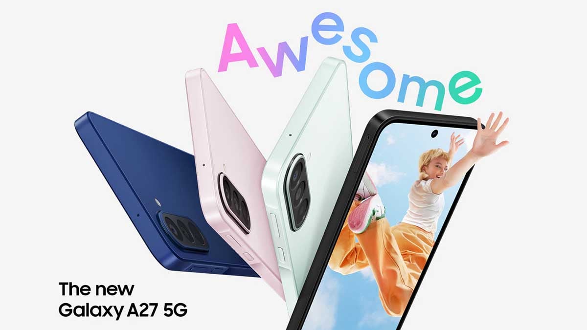
This June, Samsung has silently expanded its affordable 5G smartphone lineup with the Galaxy A27 5G, bringing a One UI 8.5 preinstalled, refreshed design and several meaningful upgrades over last year’s Galaxy A26 5G.
Samsung has replaced the Galaxy A26’s older U-shaped notch design with a modern punch-hole display on the Galaxy A27. This gives the phone a cleaner front look and makes it feel closer to the premium Galaxy lineup.
The Galaxy A27 5G comes with a 6.7-inch Super AMOLED display featuring FHD+ resolution and a 120Hz refresh rate. While the core display experience remains familiar, the new punch-hole design makes the device look more premium.
Samsung has equipped the Galaxy A27 5G with a Snapdragon 6 Gen 3 processor paired with 8GB RAM and 256GB storage. The phone also supports microSD expansion up to 2TB, giving buyers more flexibility for apps, photos, and videos.
Galaxy A27 brings five major upgrades over Galaxy A26
The punch-hole display, front camera OIS, DeX support and extended security updates make it a more refined upgrade over the Galaxy A26 for users looking for a budget-friendly phone.
1. Punch-hole display replaces the old notch
The Galaxy A27 moves to a punch-hole display, replacing the Galaxy A26’s U-shaped notch.
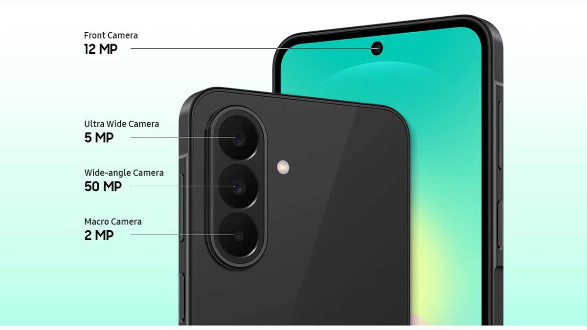
2. Improved camera setup
Compared to the Galaxy A26, the ultra-wide camera resolution drops from 8MP to 5MP, while the dedicated macro sensor has been replaced by a depth sensor.
3. Front camera gains Optical Image Stabilization
The Galaxy A27 features a 12MP front camera compared to the Galaxy A26’s 13MP selfie camera. While the resolution is slightly lower, Samsung has added OIS support.
4. Samsung DeX support arrives on the A-series
Samsung has added DeX support to the Galaxy A27, allowing users to access a more desktop-like experience with compatible displays and accessories.
5. Longer software support
The Galaxy A27 comes with security updates promised until July 2032, extending its usable lifespan.
The Galaxy A27 5G is not a major hardware overhaul, but Samsung has focused on the areas buyers notice most: design, software longevity, and useful features.

Samsung phones have had Secure Folder for years, while the One UI 8.5 brings a new Private Album feature. The new addition is totally different from Secure Folder and allows users to privately save their photos and videos.
The new Private Album feature is designed for convenience, allowing you to protect sensitive content without needing to move files to third-party applications.
Samsung’s Secure Folder and Private Album are different
Secure Folder functions as an entirely isolated, encrypted sandbox environment within the device. It lets users store not just media, but also apps, documents, files, and separate accounts.
Take it as a separate space inside your phone that acts like a clean phone. You can install apps and run them in the native view and have double accounts for almost every app.
Private Album is a new feature launched with One UI 8.5 that lets you store personal photos and videos in a protected space within the Galaxy Gallery app.
It allows you to hide specific content, including photos, videos, and screenshots, right from the Samsung Gallery app, adding a seamless layer of privacy.
That said, the Samsung Private Album is specifically developed to quickly hide photos and videos directly inside the native Gallery app, offering fast access and streamlined protection for media.
How to set up a Private Album?
- Open the Gallery app.
- Tap the Menu.
- Select Private Album.
- Follow the on-screen setup instructions.
- Tap Screen Lock and select your preferred security method.
- Set your notification preferences and tap Done to finish.

Private Album is available in non-One UI 8.5 devices too, but the setup is a bit tricky.
How to hide photos and videos?
- Open the Gallery app.
- Select the photos or videos.
- Tap More.
- Select Move to Private Album and confirm.


Samsung dropped a completely new set of icons with One UI 7.0. Since then, the company has been making minor tweaks to the components. One UI 8.5 marks a major step toward taking the design of app icons to the next level. Design-wise, the icons remain largely unchanged from One UI 8.0, but the revamp comes from the three-dimensional (3D) appearance.
There is a specific kind of change in Android UI design that takes a while to fully register. You open your phone, swipe through the home screen, and something feels different, not broken, just unmistakably more refined. That is exactly the sensation Samsung has engineered into One UI 8.5, and once you see it side by side with One UI 8.0, you cannot unsee it.
The app icons in One UI 8.5 are not just prettier. They represent a foundational rethink of how Samsung wants its software to feel.
Samsung One UI 8.5 rewrites design rules for App Icons
One UI 7.0 introduced a cleaner, more geometric approach to icons, stripping away the excess detail and opting for bold, simplified shapes.
When One UI 8.0 arrived, it kept that same visual framework entirely intact. No meaningful changes to icon shape, shading, or depth.
One UI 8.5 – The shift to three dimensions
Where One UI 8.0 icons sit flat against the home screen, One UI 8.5 icons, specifically the inner (supporting) components, carry shadows, curves, and gradients that give them a subtle but unmistakable three-dimensional quality.
Look at the difference between the two versions of any stock Samsung app.
The Calculator icon in One UI 8.0 is clean and flat, with a sharp division between its black and green segments. In One UI 8.5, the same icon gains a softness at the edges, a curvature that suggests form.
The Contacts icon, the Browser icon, and the Settings gear, each one in One UI 8.5, look as though they could be physically picked up off the screen.
![]()
Samsung has carefully calibrated this three-dimensional design. The depth is implied rather than literal, shadows are subtle, and radiants are purposeful rather than decorative. The result is icons that feel premium and modern rather than trying too hard.
The effect is visible in a cleaner way in the Themed icons. The dynamic coloring scheme aligns all the app icons based on the color palette. The application is impressively fine, and the 3D appearance is prettier.
![]()
Third-party app icons in One UI 8.5 also benefit from the same depth-enhancing treatment. This is important because nothing breaks a design system faster than a mismatched grid of icons.
The icon overhaul is part of a larger design philosophy shift in One UI 8.5 toward what Samsung is building around a Frosted Glass aesthetic.
This matters for how the phone feels to use day to day. Aesthetics in software influence perception of speed, quality, and intent. A user interface that looks premium creates the expectation of premium performance.
The jump from One UI 8.0 to One UI 8.5 on the icon front is a philosophical repositioning.
You may like:

Galaxy users are missing one useful Camera Scan feature in their phones, and Samsung appears to be reviewing its relaunch. Samsung updates are not always beneficial, as they bring functional changes that sometimes degrade the user experience.
The same happened to the native Camera Scan feature.
Select Galaxy phones have removed the instant sharing feature tied to Camera Scan, and Samsung is aware of it. The company’s moderator responded to user comments and dropped a satisfactory answer in the community.
Samsung Camera and Gallery come with a Scan feature, offered as the “Yellow T” icon. The icon appears whenever the camera or gallery detects a copyable text file in real-time camera viewfinder or gallery preview.
Tapping the icon triggers the system to recognize text in the picture and allows users to save a scanned file. Previously, this feature had an instant sharing feature that didn’t require users to save a file in the Gallery and then share.
Just tap the T icon, let the system recognize visible text content, like an optical character reader, and offer the sharing button immediately.
Camera Scan isn’t a heavily used feature for all; it is for many. Users rely on the Samsung Camera app for their frequent requirements. The removal of the instant scan feature has added an additional step for the same task.

Samsung’s camera moderator confirmed to have “forwarded the suggestion regarding the scan draft saving feature to the relevant department.” A comprehensive review will be conducted to explore the relaunch of the feature in the future.
It seems the shift is caused by a Samsung Gallery and Camera app update. One UI 8.5 is the latest official release, and some models have this feature. Meanwhile, Galaxy S phones are on One UI 8.0, lacking the instant sharing button.
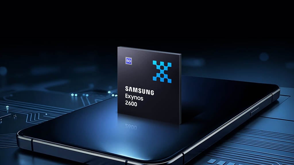
Samsung just dropped fresh MLPerf numbers on the Exynos 2600, and the result is quietly impressive. While everyone obsesses over flagship Snapdragon wins, Samsung’s in-house 2nm chip (already shipping in Galaxy S26 and S26+) is showing real progress on the one thing that actually matters for future phones: fast, local AI.
Key results from Samsung’s latest tests (via @SemiconductorsX):
- Mobile-BERT (NLP inference): 1199.57 QPS – 2.1x better than Exynos 2500
- Stable Diffusion (image gen): 0.53 QPS – 2.4x improvement
This lines up with Samsung’s earlier internal claim of 113% better generative AI performance on the NPU. It is built on the industry’s first mobile 2nm GAA process, aimed squarely at responsive on-device agentic AI and local generation instead of cloud round-trips.
These are real, public benchmarks (similar to industry-standard MLPerf tests). Samsung’s main point is clear: The Exynos 2600 isn’t just trying to match Snapdragon in regular speed and graphics. Instead, it’s heavily focused on making on-device AI fast, private, and feel instant – all running directly on your phone without needing the internet. Still, these results are encouraging.

Source – Samsung | Via – Yonhap
If you are tired of AI features that only work with a strong internet connection, this is worth watching. Can Samsung finally make Exynos the AI champion in 2026 phones, or will Snapdragon still dominate the flagship market?

One UI 8.5 comes with a redesigned Samsung Clock app, bringing UI tweaks across Alarm, World clock, Stopwatch, and Timer. The new user interface is visually appealing, with Samsung bringing modern aesthetics to Galaxy devices.
Samsung Clock app has four key pillars: Alarm, World clock, Stopwatch, and Timer. The new app version in One UI 8.5 has adopted major design changes over One UI 8.0. Let’s explore the design changes side-by-side:
Alarm
- Floating tab + gradient pink background
- All alarms combined in a single card with thin line separators
- Alarm Group view redesign (bigger card, space-saving)
Samsung revamped the Alarm screen with a visually appealing design. The new floating tab is also applied to the Samsung Clock app, realising the Ambient Design language. The page background features a gradient tint adopting a pink hue.
In One UI 8.0, the Alarm page adds separate cards for each alarm you set. One UI 8.5 changes that approach by combining all alarms in a single card, while the separation happens with a thin line.

Alarm Group view also has notable redesigns for Samsung users. Creating an Alarm group in One UI 8.5 slaps a big fatty card above the alarm list. One UI 8.5 does the same, while saving space to show more groups in the same area.

World clock
- Map preview background (replacing white solid)
- Dark-shaded cards
- Time zone converter revamp (map background + cards + bottom slider)
- Country card interface redesign (lighter blue ocean shade + dark cards)
- Smoother map animations
Samsung has replaced the White solid background in the World clock with a relevant map preview in One UI 8.5. To keep the visibility clean, the cards feature in Dark shades, rather than retaining the display mode preference.
The time zone converter page has also been revamped. While the One UI 8.0 version offers a list view, One UI 8.5 has a map background, and cards are aligned to look more engaging. The time selector slider has been added to the bottom.

Samsung’s Clock has a brand new interface for the World clock’s Country card interface. The shade of Blue used for the ocean has been tweaked to a lighter shade. Card has also adopted dark to retain visibility and complete the design.
Animations feel smoother and more reliable while exploring the map to find and add a country to the world clock. It’s a minor change, but deliver you the feeling that Samsung has made its Clock app way more modern than before.

Left – One UI 8.0 | Right – One UI 8.5
Stopwatch
- Analog clock face added alongside digital readout
- Gradient background + depth effects
- Lap and Stop buttons now in circular background containers
One UI 8.5 adds an analog clock face alongside the digital readout, complete with a circular dial, tick marks, and moving hands.

One UI 8.0 only offers a digital display, making the One UI 8.5 stopwatch significantly more visually engaging.

The stopwatch background and layout in One UI 8.5 carries the same gradient treatment and depth effects seen elsewhere. One UI 8.0’s stopwatch looks comparatively sparse and undesigned.

In One UI 8.5, the Lap and Stop action buttons now sit inside circular background containers, giving them more visual weight and making them easier to tap. In One UI 8.0, these buttons had no background fill, just bare icons.

Timer
- Gradient background (replacing flat monochrome)
- Preset time buttons with new shapes
- Start button with rounded background
- Upgraded active/running timer progress display
- Multiple simultaneous timers in scrollable layout
Matching the rest of the app’s visual language, the timer tab now uses a gradient background instead of One UI 8.0’s flat, monochrome look.
The preset time buttons have new shapes in One UI 8.5. Rather than plain rectangular chips, they use updated visual containers that feel more tactile and intentionally styled.
The Start button in the Timer tab now features a rounded background in One UI 8.5. In One UI 8.0, the button styling is comparatively plain.

Left – One UI 8.0 | Center & Right – One UI 8.5
Once a timer is running, One UI 8.5 shows a visually upgraded progress display. The active state in One UI 8.0 is functional but lacks the polish of the new version.
One UI 8.5 allows multiple timers to coexist on the same screen, stacked in a scrollable layout. Users can start additional timers without losing sight of existing ones.
That said, One UI 8.5 transforms Samsung Clock from a reliable utility into a genuinely well-designed app. One UI 8.0 was perfectly fine; One UI 8.5 is noticeably better.
-

 Updates19 hours ago
Samsung gives two retired Galaxy S phones and a Note a fresh life, now in the US
-

 Updates19 hours ago
Samsung Galaxy Watch 7, 8 and Ultra get new Wear OS update with security improvements [U: Live in USA]
-
Samsung2 days ago
16 big Samsung Clock app changes in One UI 8.5
-
 News2 days ago
Galaxy Z Fold 8 Ultra looks massive next to the Z Fold 8 and Flip 8 in leak