Android
Samsung Messages vs Google Messages: Battle of user interface and features
If you owned a Samsung device, you might have noticed that it came with two messaging apps already installed: Samsung Messages and Google Messages.
Mid-range and inexpensive Samsung phones choose it instead of the former, the default setting on top Galaxy phones. Let’s know which app is better on the basis of its user interface and features.
User Interface
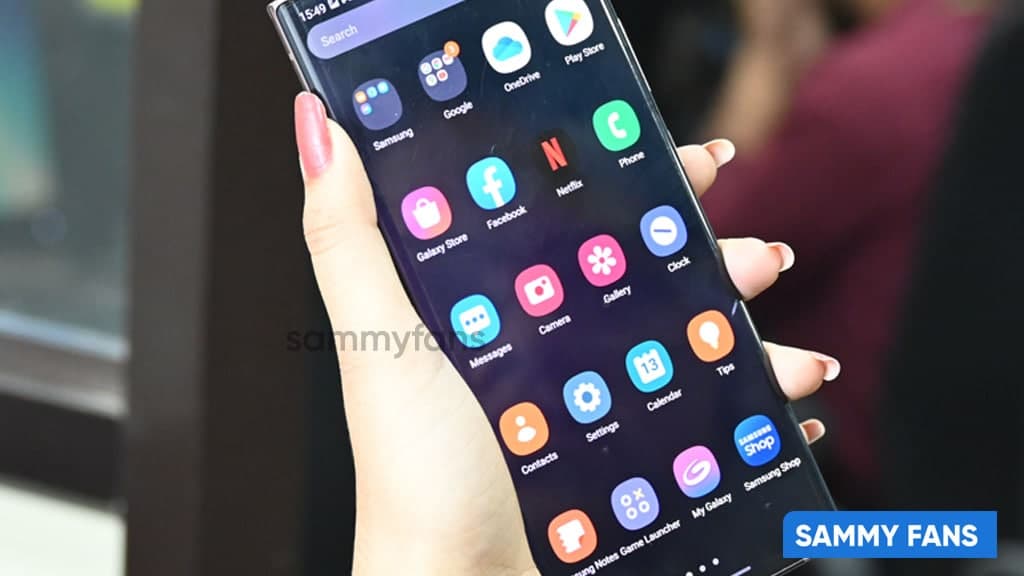
Although Dark Mode is supported by both applications, Samsung Messages does so much better than Google Messages. The former turns completely black when Dark Mode is enabled, whereas the latter just changes to a grey background while keeping the Material You style.
Download Sammy Fans App
Conversations are arranged generally starting at the top of Google Messages. The top portion of the screen on Samsung devices, however, is obliged to replicate the One UI reachability design and simply says “Messages.” To order them from the top, simply click on both applications.
While Google Messages places a small dot on the side, Samsung Messages displays a small symbol next to unread chats along with the number of new messages. The latter displays simply one line of preview text whereas the former displays two. While the latter has a search bar, the former has a search icon.
Join SammyFans on Telegram
Conversations in Google Messages are divided into four groups: Personal, Transactions, OTPs, and Offers. Samsung Messages allows you to manually define categories and displays offers, transactions, and upcoming events under its Useful Cards category in a more glanceable layout.
The Contacts tab in Samsung Messages makes it simple to locate and text your favorite people. When you hit the search bar at the top of Google Messages, suggested contacts are displayed. Swiping is used on the latter to swiftly archive conversations, whereas it is not available on the former.
Samsung vs Google – Messages Features
Both apps let you pin conversations to the top, although only one or two can be pinned at a time in Google Messages and up to 20 in Samsung Messages. Additionally, both apps feature group SMS with up to 20 recipients and let users star messages.
Follow Sammy Fans on Google News
In order to prevent your inbox from becoming cluttered once you’ve finished using them, Google Messages now gives you the option to automatically remove OTP messages after 24 hours.
Even though Samsung Messages doesn’t offer this specific function, it does let you delete older messages if you’ve sent or received 1000 texts, 100 multimedia messages, or 5000 chats.
Both apps offer floating chat bubbles, the ability to configure custom notification sounds, issue read receipts, and copy codes from the notification panel. Additionally, you can change the text size by pinching the screen in or out.
Only Samsung Messages, however, enables you to select a unique background for each session, add a message to the Reminder app, and choose a moniker that other users who aren’t in your contacts will see when you speak.
However, you can configure iPhone reactions in Google Messages such that they display as emojis rather than text messages. So these were the Google Messages vs Samsung Messages on the basis of their UI and applications Features.
On the basis of the above differences, Google Messages won. What is your view on this? Comment below.


Android 15’s Easter Egg includes a secret Landroid screensaver mode that One UI 7 might borrow. Samsung’s next One UI iteration will be based on Android 15 OS. Core Android features such as Easter Egg will be included in Galaxy’s next major upgrade.
Debuted as a Landroid screensaver, Android 15’s Easter egg was added with the latest Beta. Google News Telegram channel’s Nail Sadykov discovered that the Easter egg game is equipped with an integrated screensaver mode.
To activate Easter Egg, head into Settings followed by About phone and Android version. Once done, tap the displayed Android version several times until you see the Android 15 bugdroid logo floating in space.
Space travel mini-game will be available to play added with Android 14. When you initially trigger the mini-game, you should have unlocked the new screensaver, tucked away under Settings → Display & Touch → Screen saver → Landroid.
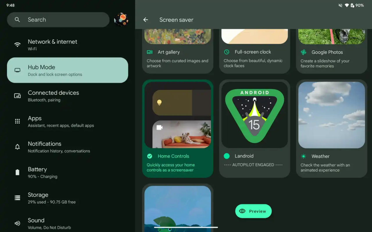
After activating the screensaver, you can set your phone on your desk. Now, the phone will let you watch the Easter egg game take over in autopilot mode, as the spacecraft automatically dodges planets – it provides a better experience on a tablet placed on a dock.
Google introduced the AI Wallpaper feature with the Pixel 8 series. The same functionality is also available in Samsung’s Galaxy S24 series thanks to Genini Nano. Now, Google is preparing to make AI-generated wallpapers sharable with Android 15.
Pixel’s ability to create AI-generated wallpapers is quite popular among users. Currently, the feature only allows users to generate stunning wallpapers and apply on the home screen and lock screen. Sharing with someone presently requires to be saved as a screenshot.
Threads user @the_husbandalorian discovered interesting evidence in the latest Beta. The company is working on a new option in Android 15 to share AI-generated wallpapers. A new share button is added on the preview screen in the wallpaper picker interface.
Post by @the_husbandalorianView on Threads
The preview will display how the wallpaper will be applied to your phone’s home or lock screen. The pencil button will allow you to refine the prompt used to create the wallpaper. Share button is all you need to share AI-generated wallpaper with others.
At present, the ability to share AI-generated wallpaper is broken. It suggests the feature is still under development and requires additional work. The next Beta might make it functional for Beta users, and we guess public availability with a Stable rollout.
AI Wallpaper in One UI 6.1
Samsung is very well known for its excellent after-sales service and software support. The company announced that it will provide up to 7 years of major OS upgrades and security updates for its flagship devices, starting with the Galaxy S24 series. This is a remarkable achievement that will allow Samsung users to enjoy the latest features and security enhancements for a long time.
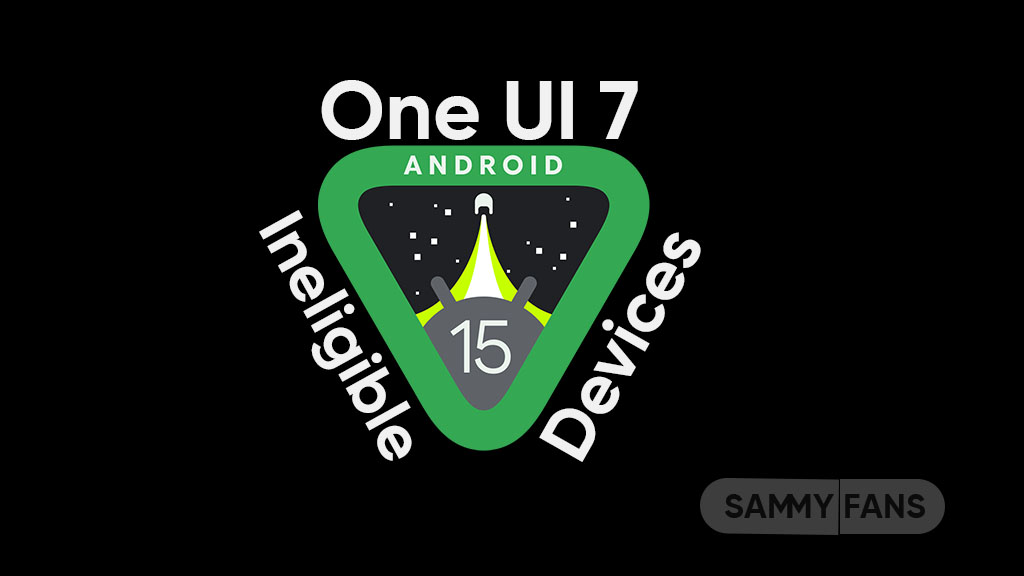
Not all Samsung devices will be eligible for the upcoming Android 15-based One UI 7 update, which is expected to bring several new features and improvements. Some older and lower-end models of the Galaxy A, Galaxy M, and Galaxy F series have reached the end of their software upgrade cycles, and will not receive any further OS updates.
Follow our socials → Google News, Telegram, X (formerly Twitter), Facebook
However, these devices will still receive security patches for another year, but they will miss out on the new features and benefits of One UI 7.
Android 15 Easter Egg [Customized by Camila Foster, Sammy Fans]
Samsung Android 15 One UI 7 Ineligible Device List
The following is the list of Samsung devices that will not get the Android 15 One UI 7 update:
Galaxy A series
- Galaxy A04s
- Galaxy A13
- Galaxy A23
- Galaxy A72
- Galaxy A52
- Galaxy A52 5G
- Galaxy A52s
Galaxy M series
- Galaxy M53 5G
- Galaxy M33 5G
- Galaxy M23
Galaxy F series
- Galaxy F23
If you own any of these devices, you may want to consider upgrading to a newer model that will support One UI 7 and beyond.
Note: The list is compiled on software update policy and previous rollouts.