Comparison
Galaxy S22 Ultra flopped in camera speed test! Redmi K50 Ultra WON

Galaxy S23 Ultra will be the next big hit by Samsung with a powerful mobile camera atop. Meanwhile, seems like, competition is rapidly increasing in the camera smartphone segment as a personal review shared by a tipster claims Redmi K50 Ultra beats Galaxy S22 Ultra in terms of camera shutter lag (speed).
According to a video shared by IceUniverse, Xiaomi’s Redmi K50 Ultra smartphone beats the Samsung Galaxy S22 Ultra, when it comes to shutter lag. To be mentioned, the former packs an HM6 image sensor, while the latter is powered by ISOCELL HM3.
Join SammyFans on Telegram
As shown in the video, Ice repeatedly tapped the camera shutter button of the Redmi K50 Ultra smartphone, and it continues capturing images per tap. On the other hand, when Ice used the Galaxy S22 Ultra and followed the same shutter taps, it just got defeated by its Chinese rival.
Download SammyFans App
Watch Galaxy S22 Ultra vs Redmi K50 Ultra camera speed video, below:
p1 K50 Ultra p2 S22 Ultra
I think the K50 Ultra is better than the S22 Ultra when it comes to snapshots, plus the Samsung shutter lag issue is a stubborn one. pic.twitter.com/1XEBVMF6Wi— Ice universe (@UniverseIce) August 17, 2022
The video can easily disappoint any Samsung consumer as we can see how the Galaxy S22 Ultra gets failed when the user continuously taps the shutter button in a very short delay. The camera test video shows Galaxy S22 Ultra shutter speed recorded in slow motion, you can now understand the level of failure.
8 Plus Gen 1 or HM6?
There are two main factors that affected the shutter lag including different image sensors and system on chip (processor). While the Galaxy S22 Ultra uses the Snapdragon 8 Gen 1 chip, the Redmi K50 Ultra is powered by its overclocked version – Snapdragon 8 Plus Gen 1.
We saw Qualcomm is ready to give orders for the next-gen Snapdragon flagship processor to TSMC instead of Samsung. The main reason is that the 4nm process technology of Samsung got failed this time, as both Exynos 2200 and Snapdragon 8 Gen 1 reportedly have multiple issues.
As Chinese smartphone manufacturers are coming to the contest, Samsung needs to work on its development and innovations. Ahead of creating new ones, the Korean tech giant should fix all the issues with basic features that consumers use the most like camera.
| Source |


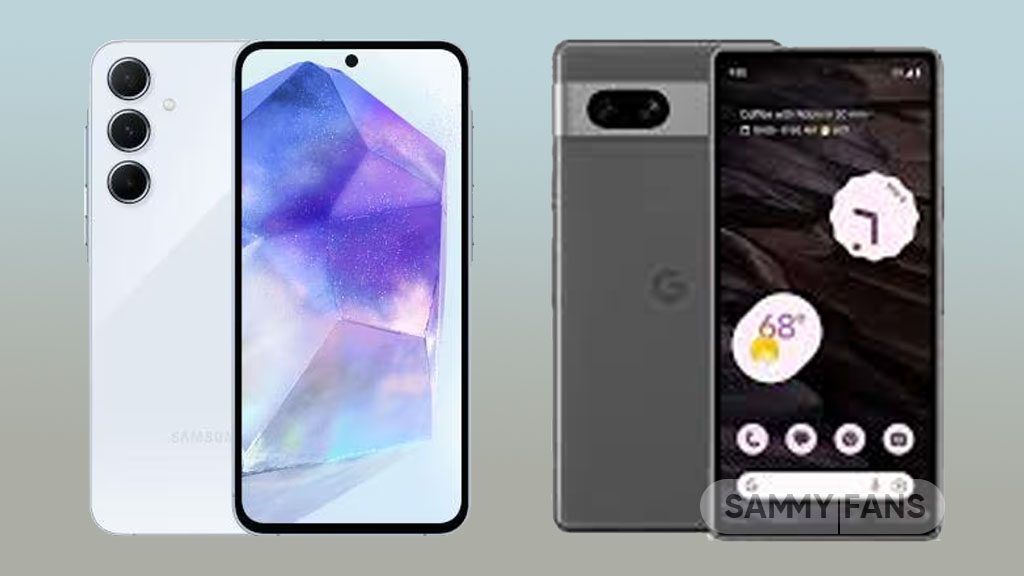
The smartphone market is growing constantly, and Samsung has recently released a new A series phone the Galaxy A55 5G, that can ultimately compete with the one launched back in 2023 by Google, yes, here we are talking about the Pixel 7a.
Samsung Galaxy A55 5G and Google Pixel 7a are two of the latest additions to the affordable segment. Both devices offer impressive features at a budget-friendly price point. So, just get ready to dive into the battle of the latest affordable smartphones.
In this article, we’ll compare these two smartphones and see how they stack up against each other in terms of design, performance, camera capabilities, battery life, and more.
Follow our socials → Google News | Telegram | X/Twitter | Facebook | WhatsApp
Samsung Galaxy A55 5G vs Google Pixel 7a
Display and Design
The Galaxy A55 5G looks sleek and stylish with its slim profile and glass back. On the other side, the Pixel 7a boasts a striking design with its matte finish and horizontal camera module. In terms of display, the Galaxy A55 5G features a Super AMOLED panel, while the Pixel 7a offers an OLED display.
Both devices provide immersive viewing experiences, the newly launched one offers a larger 6.6-inch display with 120Hz refresh rate. While the other one features a 6.1-inch screen with a 90Hz refresh rate.
Processor
Under the hood, the Galaxy A55 5G equips a powerful Exynos 1480 octa-core processor, with 8GB, 12GB RAM, and 128GB, and 256GB storage options ensuring smooth multitasking and lag-free performance. Whereas, the Pixel 7a is powered by a Google Tensor G2 chip paired with 8GB RAM and 128GB storage configuration.
Battery and Connectivity
In terms of battery, the newly launched Galaxy A55 5G is a real winner with support of a 5000mAh battery and 25W charging. As the Pixel 7a only offers a 4385mAh battery with 18W wired and 7.5W wireless charging support. Simultaneously, both devices support 5G connectivity and Bluetooth 5.3.
Camera
Now comes the photography section, for which the world is crazy, Samsung Galaxy A55 5G boasts a versatile triple camera setup consisting of a 50MP Main, 12MP Ultra-wide, and 5MP Macro lens. Whereas, Google’s Pixel 7a sport dual camera setup including a 64MP and 13MP Ultra-wide angle lens.
Software
In terms of software, the Galaxy A55 5G comes pre-installed on the latest Android 14-based One UI 6.1, but it lacks Galaxy AI capabilities. While the Pixel 7a arrived out of the box with Android 13, but it currently offers a pure and premium experience with the latest version of Android.
Color Options
Both devices offer a choice of four color options so that customers can select the one that suits their preference most. Like the Galaxy A55 is available in Iceblue, Lilac, Navy, and Lemon, while, the Pixel 7a is offered with Charcoal, Snow, Sea, and Coral colorways.
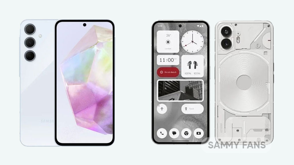
Looking to buy a new budget-friendly smartphone packed with ultimate features, functions, and capabilities, but getting confused between newly released devices – Samsung Galaxy A35 5G and Nothing Phone 2a?
If yes, then don’t think twice as Samsung leads the 2024 mid-range segment and you are at the right place because here we will discuss the design, display, performance, camera capabilities, and more aspects of both these devices, to help you decide which one is the perfect fit for you and deserves to be in your pocket this year.
Samsung Galaxy A35 vs Nothing Phone 2a
Design
Starting with the design, those who love a slim profile with premium build quality can go with Galaxy A55 5G while those who prefer to go with a minimalist approach and unique look can opt for Nothing Phone 2a. Both phones have remarkable appearance, so the choice depends on your personal preference.
Display
The Galaxy A35 5G offers a 6.6-inch Super AMOLED display with 1080 x 2340 pixels. While the Nothing Phone 2a features a bigger 6.7-inch AMOLED screen with 1084 x 2412 pixels. Overall, both device has the ultimate visual experience and smoother scrolling with a 120Hz refresh rate.
Performance
In terms of performance, the Galaxy A35 5G is powered by an Exynos 1380 processor to offer smooth multitasking and ultimate gaming, and seamless performance. On the other side, the Nothing Phone 2a features a MediaTek Dimensity 7200 Pro chip to perform your everyday tasks.
Camera
Talking about the camera capabilities, so the Galaxy A35 5G packs a triple-camera setup at the back including 50MP Wide Angle, 8MP Ultra Wide, and 5MP Macro lens to capture detailed and vibrant photos. While Nothing Phone 2a offers a 50MP dual camera, with 13MP and 32MP cameras on the front.
Battery and Software
The Galaxy A35 and Nothing Phone 2a both pack 5000mAh battery but one offers 25W fast charging, while the other provides the ultimate 45W charging support. In terms of software, the Galaxy A35 runs on Android 14-based One UI 6.1 custom skin, and, Nothing Phone 2a is powered on Nothing OS 2.5 software based on Android 14 OS.
Other details
Other details of both the phones are similar in some aspects like both are available in 8GB RAM with 128GB storage configurations, launched in March, support 5G connectivity, in display fingerprint scanner, and much more.
Follow our socials → Google News | Telegram | X/Twitter | Facebook | WhatsApp
In conclusion, both devices have their strengths and weaknesses, but as Samsung is known to deliver a more optimized experience to its users and elevated software update support as compared to Nothing Phone 2a, so we recommend users to go with the Galaxy A35 5G and the rest of the choice is all yours.
Samsung Galaxy A35 which will be unveiled on March 11 is expected to come with several sophisticated features, while Nothing Phone (2a) has already made its splash in the market with attractive design. So let’s have a quick specs comparison of the newly released Nothing Phone (2a) and the upcoming Galaxy A35.
To be mentioned, both these devices come under the budget segment, attracting a range of consumers who want prominent capabilities but don’t want to spend a big amount. So, let’s dive into the details and see how these two devices stack up against each other in the battle for the best affordable phones.
Samsung Galaxy A35 vs Nothing Phone (2a) – Specs Comparison
Samsung Galaxy A35 5G is expected to equip a 6.6-inch FHD+ display, while the Nothing Phone (2a) features a larger 6.7-inch FHD+ screen with 120hz and peak brightness of 1650 and 1300 nits respectively. Moving on, the Galaxy A35 boasts Exynos 1380 chip while, Phone (2a) packs Dimensity 7200 Pro.
In the photoholic users, the Galaxy A35 offers a triple camera setup consisting of 50MP, 8MP, and 5MP sensors, Whereas, the Nothing Phone (2a) includes a 50MP wide and 50MP ultra-wide dual camera. The newly released device comes with a Plastic body, while the upcoming will have Gorilla Glass Victus+ at the back.
Other than these there are some more aspects which make both the devices a good contender in the affordable market. Lastly, the Galaxy A35 5G is expected to be priced at €379, while, the Nothing Phone (2a) carries a price tag of €319 in Europe.
Follow our socials → Google News | Telegram | X/Twitter | Facebook | WhatsApp