Apps
Google Clock 7.4 update brings new buttons to snooze and stop alarm
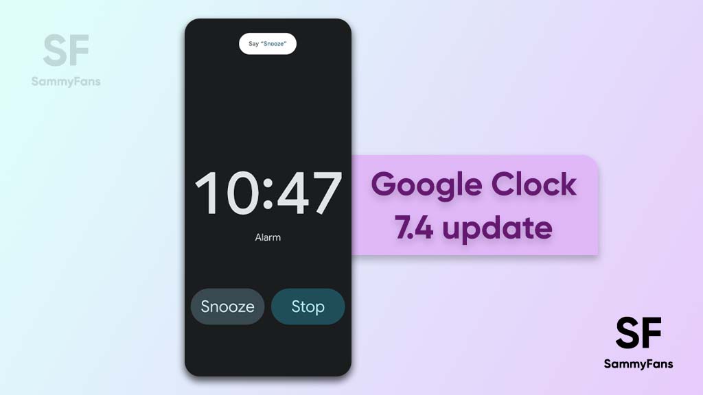
Google has started rolling out a new update for its Clock app that brings a useful new change for customers who use alarms on daily basis. As per the information, the Google Clock app is finally getting rid of the swipe gestures to Snooze and Stop an alarm and switching them out for buttons.
First spotted by Twitter user Artem Russakovskii (via XDA Developers), the US company is rolling out the Google Clock app update with version 7.4. This update brings two new buttons for the alarm that you can just tap to snooze and stop it.
Follow Sammy Fans on Google News
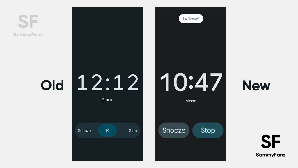
Earlier the Google Clock app used to provide swipe gestures, which were sometimes found inconvenient to use, especially when you are sleepy. Now instead of swiping the buttons you can simply tap on them to snooze or stop your alarm on the Google Clock, making it easier to use alarms.
Join Sammy Fans on Telegram
The Twitter user has shared the screenshot of the new Google Clock user interface layout that is mentioned below, with the snooze button to the left and the stop button to the right. We have also shown the older interface for a clearer difference.
It’s worth mentioning that various Google Clock app users through this tweet’s comment section have told that they didn’t find any such change on their phones. Even I have checked it but didn’t notice the change. It might be a gradual rollout that should reach other users in the coming time.
Android
WhatsApp to introduce reaction notification feature for status updates
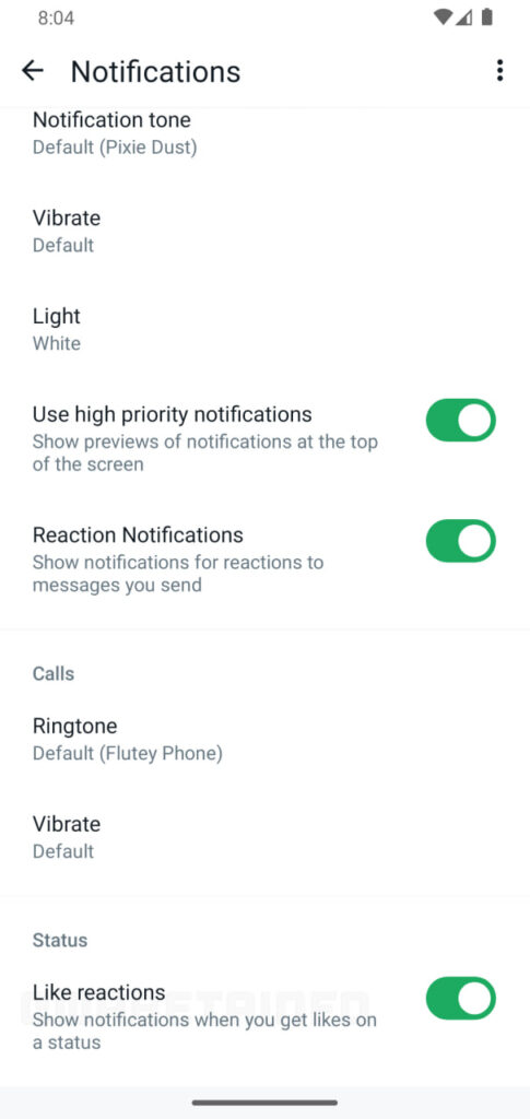
WhatsApp for Android is rolling out a new beta update, which enhances user interaction with status updates by developing a new reaction notification feature. Users can identify the new beta update through version 2.24.9.29 on Android devices.
Previously, WhatsApp had been working on a quick reaction feature. The latest beta version goes a step further by providing an option to turn off notifications for ‘Like reactions.’ This means users can choose not to be notified every time someone reacts to their status, which could be particularly useful for those who receive many reactions.
This feature is beneficial as it allows users to reduce disruptions by preventing their notification panel from being cluttered with WhatsApp reaction notifications. But for those who prefer to view reactions at their convenience, this update will allow them to do so without the constant alerts.
Moreover, WhatsApp aims to enhance users’ control over their notifications and let them decide how they want to engage with status updates. This update is still under development, so stay tuned more details will be shared as they become available.
Stay up-to-date on Samsung Galaxy, One UI & Tech Stuffs by following Sammy Fans on X/Twitter. You can also discover the latest news, polls, reviews, and new features for Samsung & Google Apps, Galaxy Phones, and the One UI/Android operating system.
Do you like this post? Kindly, let us know on X/Twitter: we love hearing your feedback! If you prefer using other social platforms besides X, follow/join us on Google News, Facebook, and Telegram.
Apps
Samsung updates Intelligence Voice Services for better performance

Samsung has pushed a new update for its Intelligence Voice Services app to version 1.1.12.38, which focuses on enhancing the overall performance and stability of the app. This latest update improves the app’s functionality and resolves existing issues for a more reliable experience.
The fresh update for the Samsung Intelligence Voice Services app does not include new features or changes but enhances the app’s capabilities. It fixes issues that users were facing in the previous version.
Samsung Intelligence Voice Service is essential for simplifying communication between Samsung’s native applications and the Galaxy Advanced Intelligence services. It sends data and specific prompts to the Language Learning Model (LLM) server, which processes the information and returns the results to the native applications.
The update enhances this service by focusing on performance and stability. The update is available for users via the Galaxy Store. If your device is eligible then you can install the update through the Galaxy Store app >> Menu option >> Updates. Also, you can download the update directly from the third-party app source link mentioned here.
Stay up-to-date on Samsung Galaxy, One UI & Tech Stuffs by following Sammy Fans on X/Twitter. You can also discover the latest news, polls, reviews, and new features for Samsung & Google Apps, Galaxy Phones, and the One UI/Android operating system.
Do you like this post? Kindly, let us know on X/Twitter: we love hearing your feedback! If you prefer using other social platforms besides X, follow/join us on Google News, Facebook, and Telegram.
Good Lock
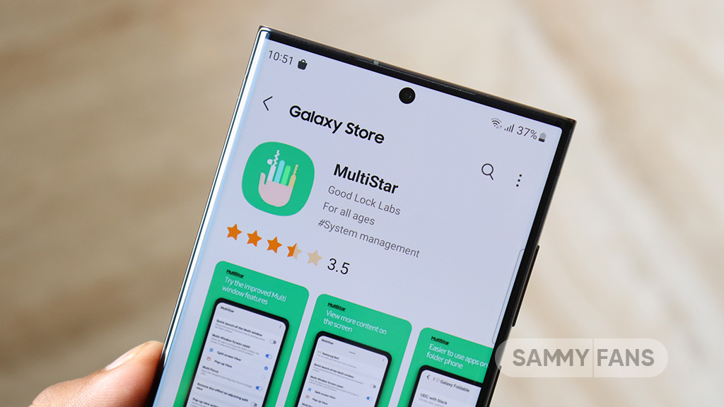
Samsung MultiStar update introduces One UI 6.1 Maintain Split mode, more
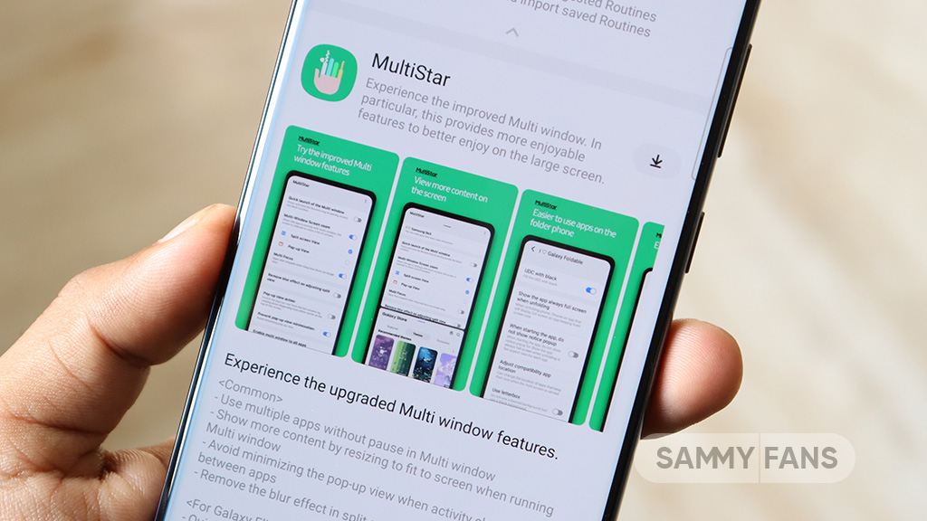
Samsung MultiStar Good Lock module is getting a new update with version 7.1.33. The new update brings new features and improvements for Galaxy tablets and foldables to enhance the multitasking experience.
The new update of the Samsung MultiStar app adds the ‘Maintain Split Mode’ function, which is available for devices with One UI 6.1 or later. This feature allows users to keep their screen view active even after closing and reopening apps to enhance productivity on large screens.
Moreover, the update enhances the visibility of the navigation bar, making it easier for users to move through their devices. It also fixes an issue where settings would not reset after app data was deleted.
This update is compatible with devices that operate on One UI 6.0 or One UI 6.1. Users of eligible devices just need to download a 16.14MB package to install the update via the Galaxy Store. Also, they can get it directly from the third-party app source link mentioned here.
Stay up-to-date on Samsung Galaxy, One UI & Tech Stuffs by following Sammy Fans on X/Twitter. You can also discover the latest news, polls, reviews, and new features for Samsung & Google Apps, Galaxy Phones, and the One UI/Android operating system.
Do you like this post? Kindly, let us know on X/Twitter: we love hearing your feedback! If you prefer using other social platforms besides X, follow/join us on Google News, Facebook, and Telegram.

